
Theme
Comparing Scenarios
Simulating a model once only tells you how it behaves today. Scenario comparison answers strategic engineering questions: "what if traffic doubles?", "how many extra servers eliminate the bottleneck?", "is it better to upgrade network or CPU?".
Rather than modifying parameters by hand, running, and noting results down in spreadsheets, you set up a parametric sweep and Jupiter executes all combinations automatically, generating comparative curves.
Configuring a Study
In the Scenarios tab on the analysis screen, studies are configured across three blocks:
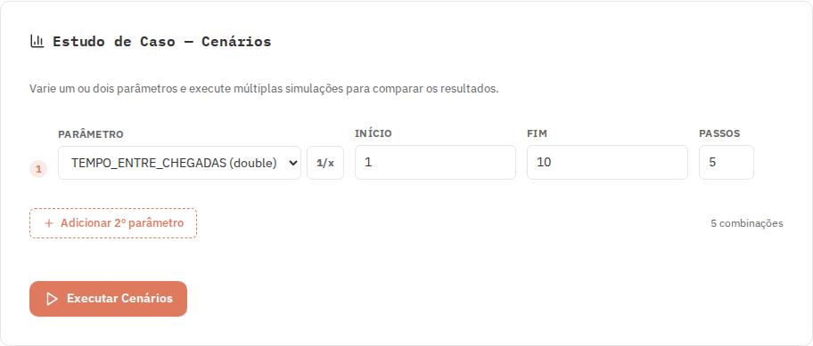
- X Axis (Primary parameter): Select the model parameter to sweep horizontally, specifying Start, End, and the number of Steps (sampling points).
- Y Axis (Observed metric): Select the performance metric whose response will be tracked (throughput, response time, utilization, etc.).
- Lines / Series (Secondary parameter, optional): Allows selecting a second parameter to plot multiple comparative curves on the same chart.
Sweeping Rate Instead of Delay
In Jupiter, transition property fields always accept mean delays (durations). However, capacity questions are almost always framed in terms of rates: "what if traffic ranges from 1 to 10 requests per second?".
Computing $1 / \text{rate}$ manually for every point is tedious and error-prone. The Scenarios tab includes the Consider as rate toggle:
- When checked, the Start and End values you enter are interpreted as minimum rate and maximum rate.
- At each step, Jupiter injects $1 / \text{value}$ into the model parameter.
- The chart axis and exported tables display
1/PARAMlabeled in frequency units (e.g., requests/s).
Range cannot pass through zero
Because $1 / 0$ is undefined, any rate interval containing 0 is rejected prior to execution.
Sweeping Two Parameters Concurrently
Adding a second parameter under Lines evaluates the full Cartesian matrix of parameter pairs.
This analysis exposes interaction effects that never appear when varying variables in isolation:
| Service time | 1 worker | 2 workers |
|---|---|---|
| 1 min | 1.1 min | 1.0 min |
| 3 min | 4.3 min | 3.1 min |
| 5 min | 10.0 min | 5.3 min |
| 7 min | 23.3 min | 8.0 min |
| 9 min | 89.5 min | 11.3 min |
Strategic Insight
When service is fast (1 min), having 1 or 2 workers yields virtually identical wait times (1.1 min vs. 1.0 min). But when service is slow (9 min), the second worker drops response time from 89.5 minutes to 11.3 minutes (an 8x improvement!).
Adding staff is only justified under heavy service workloads. This evidence-based insight guides investment decisions.
Preparing Charts for Publication
Jupiter allows formatting charts directly for papers, theses, and technical reports without external graphic editing:
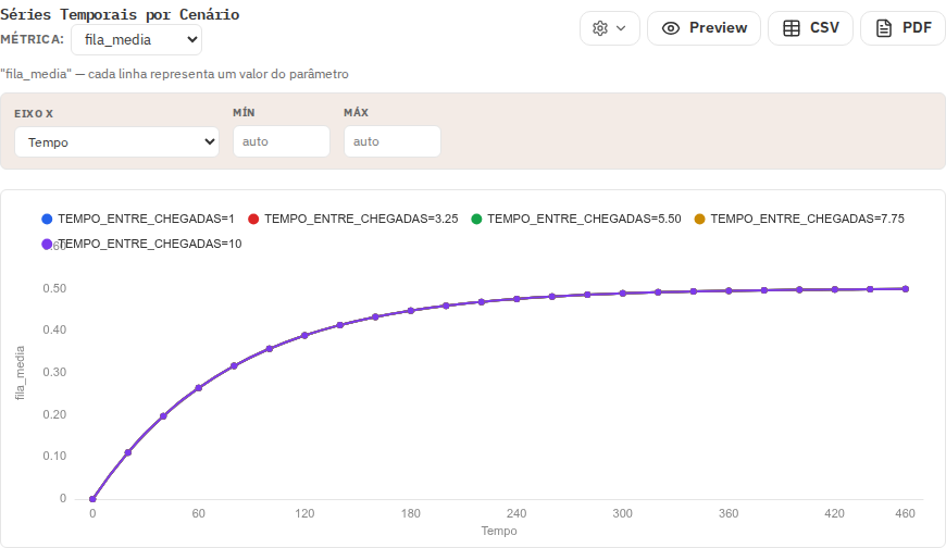
Under the chart configuration gear icon, the Chart labels section lets you:
- Replace raw parameter names on the X axis with formatted titles (e.g., "Arrival Rate (req/s)").
- Replace metric identifiers on the Y axis with clean labels (e.g., "Mean Response Time (ms)").
- Customize curve names in the legend (e.g., "1 Server", "2 Servers").
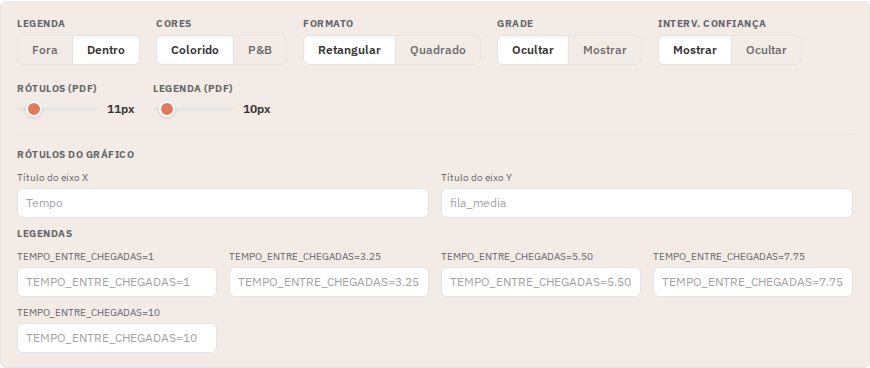
Custom labels carry over directly into vector PDF exports.
Next steps
Learn how to export data and figures in Exporting Results.